Mobile-first websites help contractors win more local clients by meeting potential customers where they actually are: on their phones during important decision-making moments.
Whether a homeowner is searching for an emergency plumber while standing in a flooded kitchen or a project manager is checking out a subcontractor from a busy job site, a mobile-first site gives fast access to contact details, service areas, and quote forms without the hassle of zooming or side-scrolling.
By putting the mobile experience first, contractors remove the roadblocks that push people to a competitor, which directly increases leads and local search visibility.
Today, over 60% of all web traffic comes from mobile devices, and for local services, that number is often much higher. For many contractors, contractor website mobile optimization is now a basic strategy for catching leads when they are active and ready to hire.
When your website works like a strong sales tool instead of a static brochure, you present your business as professional, trustworthy, and current-and easy to work with.
What Is a Mobile-First Website and Why Does It Matter for Contractors?
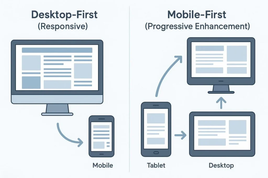
A mobile-first website is built starting with the smallest screens-smartphones-and then expanded for tablets and desktops. This flips the older “desktop-first” method. Instead of taking a large, complex desktop site and trying to shrink it to fit a phone, developers begin with the most important parts: speed, clarity, and the main action you want visitors to take.
For contractors, this matters because your “digital handshake” often happens on a five-inch screen. If that first contact is slow, confusing, or hard to use, you lose the lead before you even get to bid. Mobile-first design makes sure key information-like your phone number and estimate forms-is right at the user’s thumb as soon as the page loads.
How Mobile-First Design Differs from Responsive Design
Many people mix up mobile-first and responsive design, but they are different approaches. Responsive design is a set of methods that let a website adjust its layout to different screen sizes. You can have a responsive site that was built desktop-first, which often leads to a rough mobile experience where elements stack badly or images load slowly, even on fast connections.
Mobile-first design, sometimes called “Progressive Enhancement,” starts with core mobile features and adds extra elements as the screen gets larger. This keeps the site lean and fast for most users. It forces focus on what truly matters, cutting out clutter that might look nice on a big monitor but only frustrates someone on a phone.
Why Are Most Clients Searching for Contractors on Mobile?
The image of a client sitting at a desk to research a major home project is outdated. Research now happens on the move. Homeowners use their phones during lunch breaks, in their cars, or while juggling other tasks at home. They want quick answers and immediate options. When an urgent problem appears-like a failed HVAC system or a leaking roof-their phone is the first thing they grab.
B2B clients in industrial and manufacturing fields also rely heavily on mobile. Project managers on site and purchasing staff in meetings use smartphones to find parts, emergency contacts, and suppliers. If your site is not ready for these short, high-intent moments, you are practically invisible to a large share of your potential customers.
Are Mobile-First Websites the New Standard for Contractor Success?
Yes, mobile-first has become the standard. Since Google moved to mobile-first indexing, the mobile version of your site is now your main version in Google’s eyes. A great-looking desktop site does not help if the mobile experience is poor. If your mobile site is slow or hides content, Google treats it as low quality, which can badly hurt your rankings.
Beyond search performance, a mobile-first site reflects your company’s attention to detail and professionalism. In construction and home services, your reputation is built on reliability. A website that looks old or works poorly on a phone sends a quiet message that your work might also be outdated or unreliable. A clean, fast mobile experience builds trust quickly and can be the deciding factor when a client compares bids.
How Mobile-First Websites Boost Local Visibility for Contractors
Local visibility is the lifeblood of a contracting business. Most of your clients search for “contractors near me” or for specific services in their area. Mobile-first design is built to perform well in local search, helping your business show up when someone nearby needs help.
Mobile-First Impact on Local SEO Rankings
Google favors mobile-friendly sites in search results because it wants users to have a smooth visit. Mobile-first sites usually have lower bounce rates-people stay longer-because the site is easy to use. Google treats this longer time on site as a sign of quality, which pushes your rankings higher. Faster load times, a key part of mobile-first design, also play a strong role in Google’s algorithms.
Improving Google Maps and Local Pack Placement
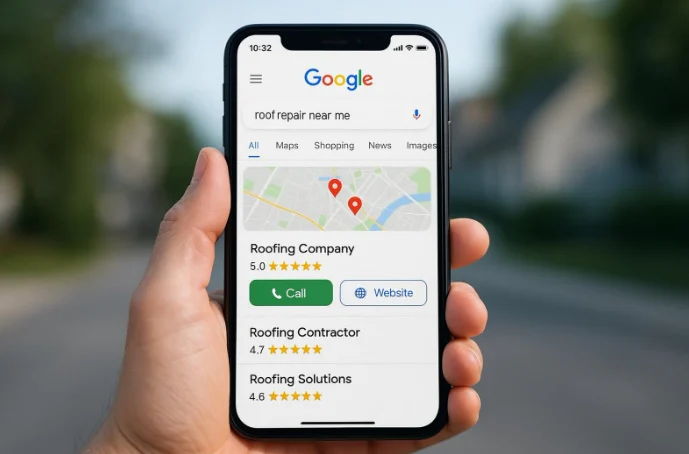
When people search for local services on their phones, Google often shows the “Local Pack”-a map and the top three business listings. Mobile-first sites are more likely to appear in this area because they meet Google’s strict usability rules. Since 30% to 40% of customers find local businesses through maps, having a site that works smoothly with these features is key to driving calls and visits.
Location-Based Features That Attract Nearby Clients
Mobile-first sites can use a phone’s GPS features. By adding tools like a Google Map widget or a service-area checker, you give visitors clear information about where you work. A prospect can quickly see if you cover their neighborhood, removing another barrier and making it easier for them to choose you instead of a competitor farther away.
Key Elements of Effective Mobile-First Contractor Websites
To win more clients, your mobile site should do more than just shrink your desktop site. It needs features that match how mobile visitors behave-often distracted, short on time, and ready to act.
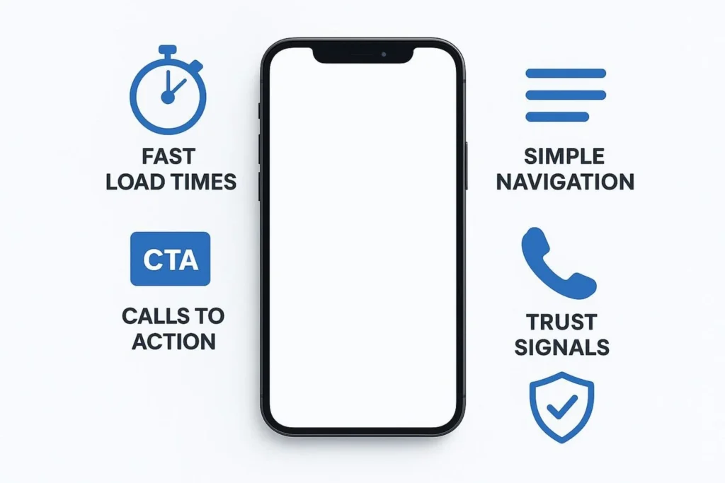
Fast Load Times and Core Web Vitals
Speed is non-negotiable. Marketers suggest keeping loading time under 2.5 seconds to keep visitors from leaving. Even a one-second delay can cause users to abandon your page and call the next contractor in the list. Mobile-first design cuts out extra code, compresses images, and uses browser caching to keep pages light.
Simple and Intuitive Navigation
Small screens mean simple menus. “Hamburger menus” (the three-line icon ☰) are a common way to hide secondary links and keep the screen clean. The goal is to help people find what they need-your portfolio, license details, or services-with as few taps as possible.
Clear, Clickable Calls to Action
Your main Call to Action (CTA) must stand out and be easy to tap. On mobile, your primary CTA-like “Request a Quote”-should be visible as soon as someone lands on your site. Use clear colors and direct language to guide visitors to the next step in hiring you.
Click-to-Call and Easy Contact Options
Click-to-call is one of the strongest mobile features. People on phones do not want to copy and paste a number; they want to tap and call. Making your phone number clickable and easy to see can greatly increase the number of leads you receive.
Streamlined Estimation and Quote Request Forms
Long, detailed forms are the biggest source of friction on mobile. A mobile-first site uses short forms with only the key fields and large, touch-friendly inputs. The easier it is for someone to share project details, the more completed forms you will get.
Optimized Images and Visual Content for Mobile
Strong project photos matter for contractors, but large files slow your site down. Mobile-first sites use responsive images that adjust to screen size. This keeps your work looking sharp without hurting performance on slower mobile networks.
Consistent Branding and Trust Signals
Trust grows from consistency. Your mobile site should show your logo, professional memberships, licenses, and clear links to reviews on platforms like Google and Yelp. Easy access to your social media lets visitors quickly see past work and customer feedback, building their confidence in your skills.
How Mobile-First Websites Improve the Client Experience
A good user experience turns casual visitors into paying customers. By removing the technical issues common on old sites, you make hiring a contractor feel simple and modern.
Instant Access to Business Information On-the-Go
If a client wants to know your hours, address, or whether you offer 24/7 emergency service, they should not have to dig for it. A mobile-first site brings this key information to the front, giving fast answers to the most common questions from people on the move.
Quick Bidding and Communication for Job Requests
In contracting, speed often wins. A mobile-ready site lets you respond faster. When a prospect fills out a short form, it can go straight to your phone, letting you send a quick estimate while a competitor is still waiting for an email from a clunky desktop-only “Contact Us” page.
Mobile-Friendly Portfolios that Build Confidence
Clients want proof of your work. A mobile-first portfolio uses swipeable galleries and optimized videos to display your projects. This lets prospects flip through “Before and After” photos while standing in line for coffee or between meetings, building trust in your abilities throughout their day.
Common Mistakes Contractors Make on Mobile Websites
Many contractors have good intentions but still fall into traps that hurt performance on mobile. Knowing these mistakes is the first step to fixing them. Partnering with a specialized agency like BuiltFor Studio can help you avoid these pitfalls and ensure your digital presence is as solid as your construction projects.
Ignoring Site Speed and Loading Time
Some contractors upload huge, uncompressed photos of recent jobs. The work looks great, but the page may take 10 seconds to load on a phone. Most users will not wait that long. Speed must be treated as a core part of your marketing, not an afterthought.
Complicated Forms and Poor CTA Placement
If your “Request a Quote” button is hidden at the bottom of a long page, or the form demands 15 fields, you will lose leads. Mobile visitors have little patience; if the process is hard, they will choose another contractor who makes it simple.
Neglecting Device and Browser Compatibility
A site that looks good on an iPhone can be broken on an Android phone or in a different browser. Many contractors do not test across devices, leading to layout problems that make their business look unprofessional to many users.
How to Move to a Mobile-First Website as a Contractor
Shifting to mobile-first does not always mean a total rebuild from day one, but it does require a new way of looking at your online presence.
Prioritizing Core Content and Conversion Paths
Start by listing the most important paths visitors take. For most contractors, this looks like: View Services → See Portfolio → Contact/Request Quote. Make these paths as short and clear as possible on a phone, trimming anything that does not help someone move closer to hiring you.
Testing Across Real Devices and Screen Sizes
Simulators help, but real devices tell the full story. Test your site on different phones and tablets to confirm buttons are easy to tap and text is readable without zooming. Try it on slow Wi-Fi, in bright light, and in other real-world situations to spot problems you might miss at a desk.
Avoiding Disruptive Pop-ups and Interstitials
On a small screen, a pop-up can cover everything and be hard to close. This frustrates users and can also lead to search penalties. If you use pop-ups, make them easy to close, show them at the right time, and keep them from blocking main content.
Monitoring Analytics for Mobile User Behavior
Use tools like Google Analytics to see how people on phones use your site. Do they leave on a certain page? Is your mobile conversion rate lower than desktop? Data helps you decide what to fix so you can get better results from mobile traffic.
Frequently Asked Questions About Mobile-First Websites for Contractors
As you think about upgrading your online presence, you may have questions about moving to a mobile-first setup.
Is a Mobile-First Site Expensive to Build or Maintain?
There is an upfront cost for good design, but a mobile-first site often saves money over time. By running one responsive, mobile-first setup, you avoid managing separate mobile and desktop versions. It is a long-term investment in your business.
How Soon Will I See Results After Going Mobile-First?
Many contractors notice better engagement and higher-quality leads right away. SEO gains can take a few months while Google re-indexes your site, but improvements in conversion rate-turning visitors into leads-often appear as soon as the new site launches.
Should I Replace My Existing Site or Redesign It for Mobile?
This depends on your current site’s age and condition. If it is more than five years old, a full mobile-first redesign is usually the best way to meet current standards. If it is newer, a detailed review and phased updates can often bring it up to par.
The move to mobile-first is not a short-lived trend; it is the current and future direction of the contracting industry. By adopting this approach, you are doing more than updating a website-you are improving how you connect with your community. As new tools like Augmented Reality (AR) let homeowners “see” a renovation through their phone cameras, having a strong mobile base will separate leading contractors from the rest. Making this shift now helps keep your business at the top of the list for local clients in the years ahead.